 |
 |
 |
 |
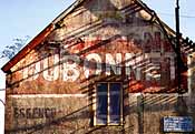
| The first picture shows DUBONNET
in its most common appearance. The name is overwritten
by another brand
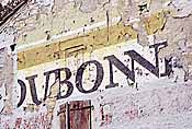
(Rochefort in the Home and Garden section), but we still discern the habitual type face. (Click the picture for the same mural with clear Dubonnet.) The second picture shows a deviation from the common rule. The type isn't in 3D anymore. The colour choice changed dramatically from blue to red. The top-layer makes good use of the available wall space and uses contrasting colourblocks. The older layer features an all white background with the same type. The baseline deviates from the horizontal, but don't let you take away by cheap effects: the type is the same not italicized. See picture 6 for a non-blocked white on red mural. |
The third picture is
much higher level. The baseline is slanted, but the characters are in
italics and thus don't seem to fall back as in the
Chatellerault case. We recognise the trusted blue and white colours with 3D characters.
Opposite corners of the
canvas are filled with red triangles. Buy French it says.
Without words, by using the colours of the French Flag.
The fourth picture sticks to the French colourset.
|
| The fifth
mural is a threefold repetition of probably the third picture theme.
The brand changed colours again and comes now in lighter shades of blue.
The 3D-shadows are ochreous instead of the usual black.
If it wasn't for the quinquina, it could have been mineral water.
|
|
 |
||
| near Champfrémont (N12, France),
xi.1999; pict. A. Guët |
| The last mural (7) shows the brand in its most bizarre appearance. A fancy type face with the ligature double 'N' and a new background colour. I wonder if it did any good. |
|
 |
||
| Near Cahors (France), 23.x.1999 |
| More pages: | Dubonnet page 1
Dubonnet continued Vins au quinquina page 2 (other brands) |
|---|---|
| Other liquor pages: | Les Cognacs
Martini and other vermouths Other liquors |
| Related: | Beer
Other drinks |