Home / Animals in advertising / Fish / Colourful fish
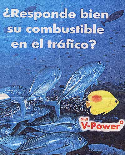
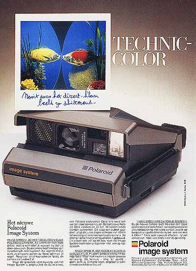
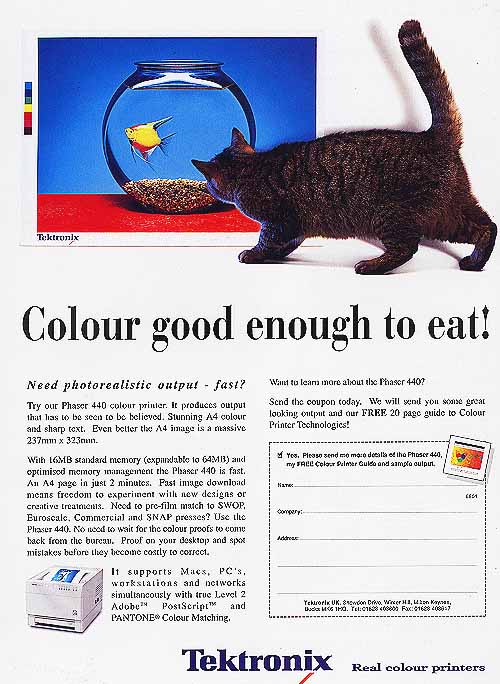
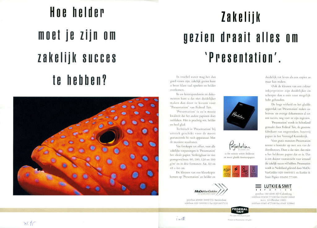
Animals in advertising — Colourful fish
When I learned animal systematics Pisces were grouped into four classes. That's exactly so in advertising. Copywriters recognize single-colour fish (popular name: goldfish), bright multi-colour fish (tropical fish), dangerous fish and other fish (mostly small and gray). Most copywriters target us using the first two groups: proof of the idealized world in adverts.
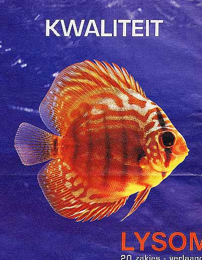
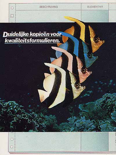
Colourful fish tell us even less than goldfish. Most are used for their colours (exactly) and in many ads a swap with anything coloured wouldn't change a thing.
© 
first published: x.2001, updated ii.2003, x.2005, vi.2006, vi.2022

But browsing our
samples back and forth and again we were able to find some constants. More than Goldfish stand Colourful Fish for outstanding, best of its kind, leaving the pack behind. That is particularly clear in the first two examples.
The Impact ad for colour printers (1) literaly says … and stand out from the gray mass. Professional reports are only one push on a button away.

The fuel ad from Argentina (2) follows the same line of thinking. Is the fuel you use good enough for the traffic? And the colourful fish escapes from the slow dull-eyed mass. The same brand lets a goldfish announce premium service (Goldfish No. 8).

(1) 2000 – Impact for colour printers
(2) 2000 – Is your fuel up to the traffic?
(3) 1986 – Never was an instant image so brilliant.

Most copywriters don't
put gray and colours against each other, but consider the colourful fish alone strong enough to emit quality. Instant photography (3) with you-won't-believe-your-eyes bright pictures or flat screens without distortion (4), it is all accentuated by the bright fish. The same holds true for example 12. The picture quality of this LCD television set is broadcast by the colourful fish and enhanced with a fish jumping out of the bowl. This is the conventional way of telling to leave behind current limitations.

The Colour good
enough to eat (5) adheres to all conventions at once. Reliable colour for professionals is sold between white borders with colour reference bar. (See also Goldfish No. 12 and 13). But (Photo)-realism is also often suggested with cat and fish or mouse. Cat has kitties and can't come to the set? Use mouse with cheese. [Illustration 5] gives some examples.

(4) 1999 – Flat screens titillating the eye
(5) 199? – Colour good enough to eat!

(6) 2000 – Thank God, it's a … — anti-slip
Sometimes a designer
manages to surprise us with a refreshing approach of a known theme. Looking at advert 6 our brain circuits promptly start humming better than life photo-realism and only a second look reveals that the cat is after a real fish, not a picture ! That gives us an entirely different story. The anti-slip mat really can save lifes.

Colours come to
life in both Nos (7) and (8).
How bright do you have to be to have success in business? (7) And then It may be good to fish in murky water, but from a business point of view it is better to speak clear language… Choosing for this paper would be a good start. In this advert the superior colours in print are important. The same make ran also an advert where a toad was shown, but then to stress the smoothness of the paper.

The second advert (8) six years after the former uses the same fish for a similar message for a similar product. This specific species is probably chosen because of the bright blue dots : the story mentions dot precision, brightness, colours. Later on we will see how not only the same species, but even the very same individual is used on several occasions. Could it be because of a shortage in stock pictures?

(7) 1995 – How bright is needed for business success? — Paper for copiers, printers
(8) 2001 – Dot precision, high colour sharpness, smooth surface, exceptional shine. — Paper for copiers, printers
(9) 1998 – Life, Lifestyle

Up to this
point, when we put some effort to it, we were able to find if not the at least a line of thinking behind the use of fish in a particular case. The remaining ads are problematic. Other creatures, toad-stools or life-less objects could transmit the message at least equally well.

Tropical fish in
(9) stand for nothing specific. I fail to understand the Life, Lifestyle wristwatch message. Okay, the idea is to buy a set of two, but why the fish ? It is not for the first time I have a problem understanding adverts for watches ([Illustration 2]).

The double page
ad for a drug against respiratory problems (10) is a real mind teaser. It's about quality: much?, broad?, square?, high?, fishy ? It's difficult to believe they couldn't come up with something better than fish to say High quality for a small price — as if someone really would believe it. Perhaps a strange shortcut during a brainstorm let them fall off the quality-price thread into slimy fish and mucus in the bronchi.

Four fish in
a row for carbon-less multicopy forms (11). Once more a clear case where any­thing else would do. The poor devil was chosen by accident and then duplicated. It is remarkable that copiers often use this technique of showing duplicated animals, but never with fish (they prefer Lady-bugs, or Elephants). Is it a coincidence that Zebra fish were used ? We know that Zebras are often used in advertisements for (colour) copiers.

(10a) 1997 – Quality
(10b) 1997 – Price
(11) 1988 – Sharp copies for quality forms

(12) 2006 – Image is everything — LCD television

Other sections in
this chapter :

Home / Animals in advertising / Fish / Colourful fish