 |
 |
 |
| St Hilaire le Grand (France); iii.1998 | Tours (France); xi.1997 | France; vi.1997 |
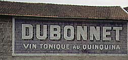
| Dubonnet - vin tonique au quinquina | ||
|
|
|
| St Hilaire le Grand (France); iii.1998 | Tours (France); xi.1997 | France; vi.1997 |
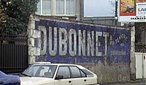
| Dubonnet - vin tonique au quinquina | ||
The antique advertising people had a no-frills way of doing. They showed the brand and added a short (preferably one word) description of what it really was: quinquina Bourin, Gentiane Suze, Cognac Martell, and the vin tonique au quinquina: Dubonnet.
Many contemporary advertisements promote a feeling and not the product.
Too simple to be true? You're right. The real message was.
In magazines you could read:
Not one word about bananas.
A recent advertisement for beer just says men.
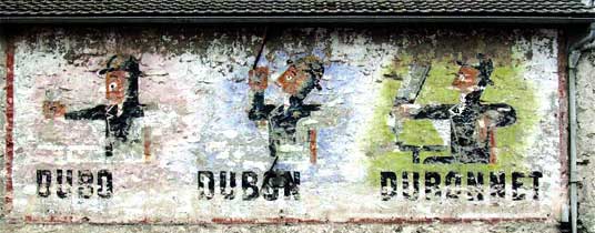

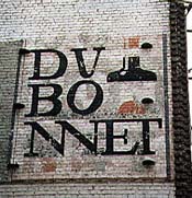
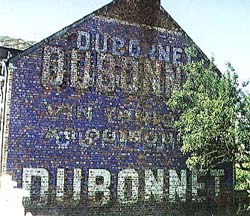
We can distinguish several layers with Dubonnet, Byrrh and Ripolin fighting for space. The most important feature was close of being ripolined out: the very rare Dubonnet Man.
This is one of the few advertisements deviating from the dry brand-with-short- description rule. Moreover, the extra element is not a picture of the product itself (as with Wiels beer), but kind of a mascot. Although the Man lost his splendour, he is still very enjoyable; to the finger-nails!
Dubo, Dubon, Dubonnet sounds like
It is nice, it is good, it is Dubonnet
or even It is just plain good.

| Next pages: | Dubonnet page 2 with fancy layouts
Dubonnet continued Vins au quinquina page 2 (other brands) |
|---|---|
| Other liquor pages: | Les Cognacs
Martini and other vermouths Suze Other liquors |
| Related: | Beer
Other drinks |