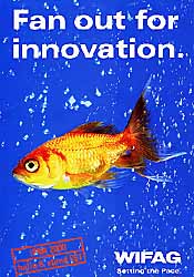
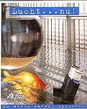
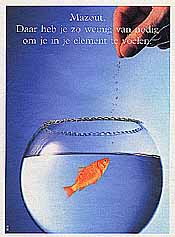
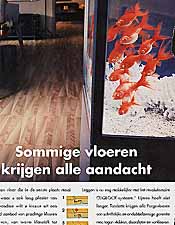
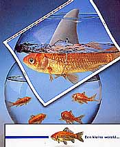
The fish staring
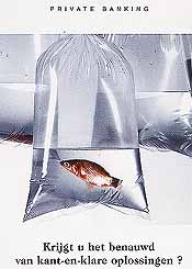
at the floor (10) do not add anything to
the message. They could have been replaced by almost everything equiped with eyes and living inside our homes.
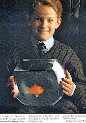
My favoured fish
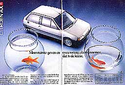
advertisement is the one for the Citroën (11) taking a bend
in the road. In any other car the boy would be soaked. There is no direct connection with the fish,
yet nothing else would perform better.
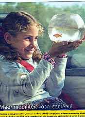
In 2005 a bus company brings an advertisement (12) which is quite similar at first glance.
The new lines of the urban network will move everybody to everywhere everyday
which means that
the standard conventions apply: the fish bowl stands for the restricted freedom of movement
soon to be remedied.
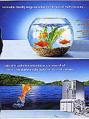
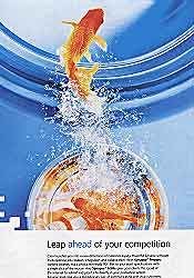
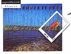
The next goldfish
is hilarious (13). The brochure opens with
a small world …
and on the inside continues with
Everyday surprising facts can be discovered in the fascinating
richness of the living world …
Guess what, we are talking about
coated paper for presses ! The same supplier has a weak spot for bears also.
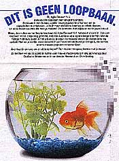
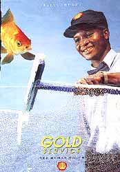
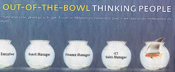
It is perhaps time to take a quick look at advert 15.
The job advert states that this communication agency is looking for out-of-the-bowl thinking people who
help our customers to have a sharp image
. If you have to transmit out-of-the-box would you end
up with the result of № 15 ? And if playing with sound had you brought to the bowl idea, in what
way is the goldfish of (15) thinking out of the box ? Is it pure coincidence that both adverts (13 and 15) feature
the same image and both are failing to make a connection with the text ?

