Animals in advertising - Bears
Bears, irrespective of their colours, are mainly used to impersonate strength, or power, or endurance. We find this symbology in about 30 % of our samples.

In half of the other adverts (tell me, which fraction is that of the whole?) bears are not chosen because they are what they are, but because they live in a cold and harsh environ­ment or also because of their sometimes humanlike posture.

In most of the other advertisements bears stand for nature.

© 
first published: xi.2002, update vi.2006

I was surprised
to learn how wide a range of products or services a bear is able to recommend : mineral water, airlines, drugs, vitamins, windows, cars, urban transport, printing paper, etc. Copy-writers seem to love them probably for the same reason why penguins are so popular. Bears have an expressive face, often stand on two feet and they touch a string because they act so human. And unlike penguins bears do facilitate some agreed upon thoughts in our minds. A bear is strength, or power, or Russia, or hibernation. In a word a bear is a better than average actor in an advertising campaign.

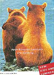
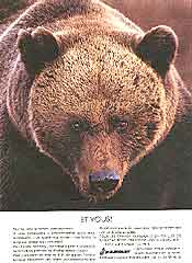
(1) 1991 – Your Russian partners are waiting. — airline
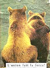
(2) 1993 – Union is strength. — packaging
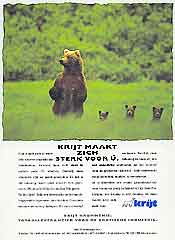
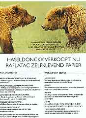
(3) 1997 – Krijt vouches for you. — supplier for the graphic industries

If only there
was some more material in the image banks. There clearly is a shortage on the market. It is the first time that we notice the same shots coming back for different brands. That is a lucky coïncidence because it learns us a bit about how a picture works.

An image may
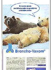
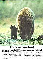
be worth a thousand words, but this lot indicates that the message emitted is not unequivocal unless you specify it in words. Look f.e. at the first two adverts (1, 2). The image s.s. in my opinion radiates care, trust, and love where one animal is comforted by the other. Look at the text (1) and you know that it is wrong (even naïve, you cannot outsmart a copy writer) to read the image that way. Gone are the bears. Here comes Russia. Gone is the protection. We are at the same level, we talk partnership. And without anybody noticing a huge problem arises. So we are talking partnership between a Russian and another player. The Russian player is represented by a bear. Then, where is the partner from abroad ? There is none left; the image is blown up by the text. The text of advert (2) – United we stand – stays much closer to what we see and is therefore much more solid.

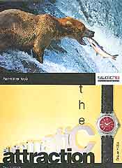
(4) 1993 – the automatic attraction. — wrist watch
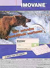
(5) 1999 – Alert wakeup; Avoid dependence. — sleeping-pills
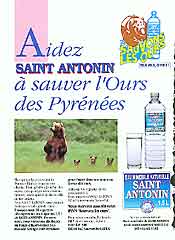
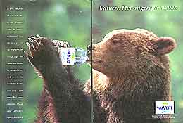
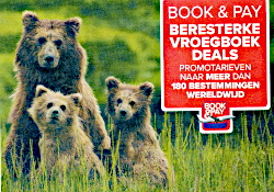
(6) 199? – Help us to save the Pyrenean bear. — mineral water

Let's have a
look at couple (3) – (6). I see a mother with children initiating all the usual sweet feelings. The advert for the mineral water (6) does not add any caption. The image is rightly used as is and acts as a catalyst. (note: the design of the advert may be fine, but I have still some words to say about the campaign [Illustration 3]) The designer of No. 3 uses the same image — still radiating caring motherhood — to transfer strength. He clearly thinks that the accompa­nying text defines which message an image transmits. That is often true, but not in this case.

Take a look
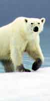
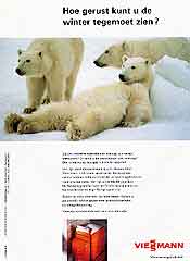
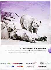
at the trio (7), (8) and (9) before we fold back to our subject. There is probably only one picture in the world showing a bear lying on his back. So three brands took it to impersonate to relax. No. 7 was used several times for heating systems more in a figurative way than the picture itself: Can you keep your peace of mind with the winter closing in ? The link with a polar freeze strengthens the message.
Why advert 8 needed the brown bear brushed in is beyond me. Also the link with the polar environment seems less than optimal. Is not precisely the cold air of the north the least seeded with infectuous material? This bear could do without his pills.

(7) 1997 – Can you keep your peace of mind with the winter closing in? — central heating
(8) 1997 – I am not afraid anymore for infections. — immuno-stimulant
(9) 2002 – It's natural to want to be comfortable. — airline lounges

Bears are mainly
used to impersonate strength, or power, or endurance. About a third of our samples fall in this category and most relate to vitamin coctails or immunotherapy. Adverts of this type are quite straightforward : see (10) – (13) and (26), (28).

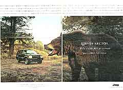
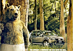
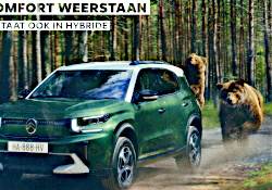
The car ad (14) belongs also to this strength-group. The text follows the Universal Standard for Car Adverts (USCA) — don't rush to your local library. I just made it up.
The USCA green book says that

  • the writer should find some facts about the chosen animal
  • it should be possible to relate the chosen knowledge bits to features of the car
  • it is best to choose impressive figures related to velocity, acceleration or power.
  • the animal should be better than the naked human, but only second to the car (or in other words: the car should bring an improvement against Mother Nature.)
  • it is good practice to spice the text with a mild beastly (macho) choice of words.
  • the advert should contain some mild humour and a touch of adventure.
Let's get back
to advert (14) and see how it performs against the best practices. The text goes as follows (translated from Dutch): An adult Grizzly measures more than 2m70 and weighs sometimes more than 400 kgs. (rules a and c) ● They are good swimmers, excellent climbers and catch up easily with humans. (rules b, c, d) ● Except when he is sitting behind the steering wheel of course (rule d, f) ● The … has engines with muscle … growls awfully when needed and speeds ahead with a satisfied purr. (rule e) ● … one final suggestion  stay in your car for the pic-nic. (together with the setting: rule f)

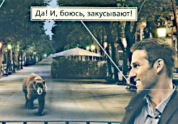
Notice that this is one of the very few (if any) advertisements where we can actually learn some­thing about bears! Advert 28 also gives some information but it is clear that nobody took the effort to check the facts. We have more examples of car advertising: with Elephants (with minimal use of text, but still quite close to the book) and also several with Penguins.

(10) 1992 – Strong as a bear — immuno-stimulant
(11) 1992 – B-V creates resistance. — immuno-stimulant
(12) 1993 – Strength becomes tenderness. Power gives protection. — immuno-stimulant

(13) 1997 – Tired! Empty! Exhausted! — tonic with vitamins
(14) 1998 – Ursus arctos. Normally you won't find such power behind the wheel. — terrain vehicle.

Next page:
Bear 2
  • Sometimes strength doesn't mean power.
  • The bear as a symbol for Nature