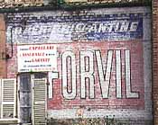
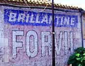
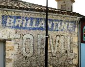
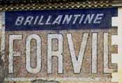
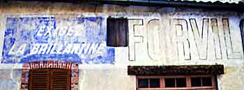
The first series of pictures
shows the primitive Forvil: all text is in uppercase characters, stating
the brand's name, short description or suggestion.
The characters only have a borderline. Unlike
many other brands Forvil didn't fancy shadows.
The Abbeville mural shows a new
colour scheme. Yellow becomes the main colour.
The type face stays the same. The message also brings more information.
Forvil states its strong point: the excellent ingredients.
The St-Maure wall goes further and stresses the good results. The mural from La Mure finally
stresses the superior shine.
At some point the brand started to play with the colours.
They stay the same — blue, white, red —
but they are swapped and a new colour (yellow) is introduced.
The borderline is gone and the St-Maure wall
features for... in a round, lowercase type face
with a special 'f'.
I guessed the usual ...vil
hidden by the Touraine.
The Port Rémy wall though proves this supposition wrong.
It was quite a squeeze but eventually the wall gave up.
The product coiffant souple is forBRIL
where the bril is written in italics.
Doesn't sound nor looks brilliant: forbril


