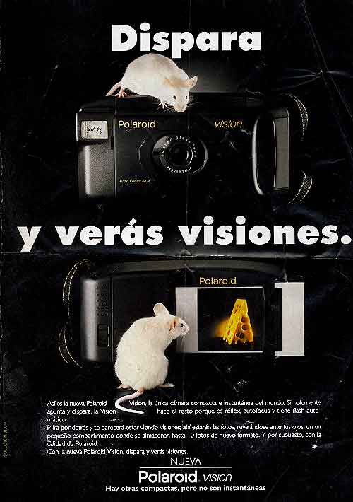
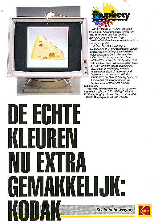
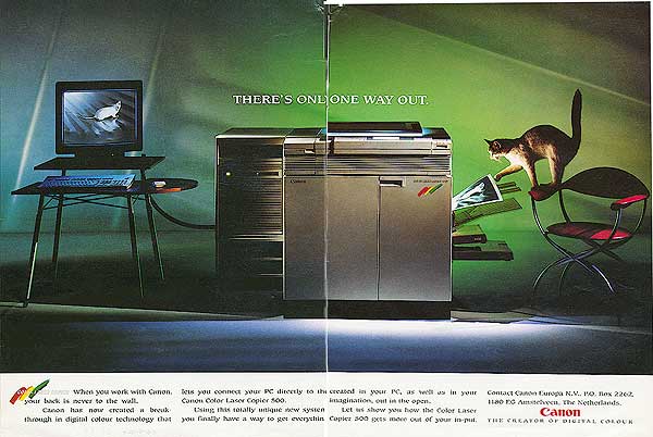
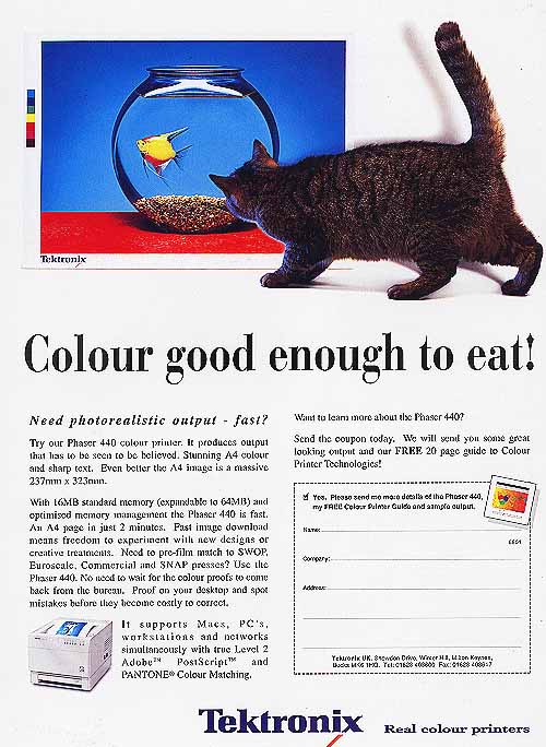
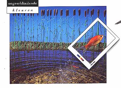
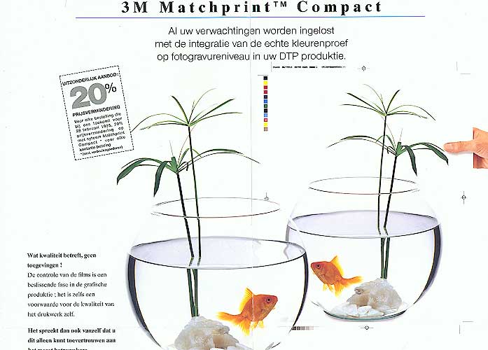
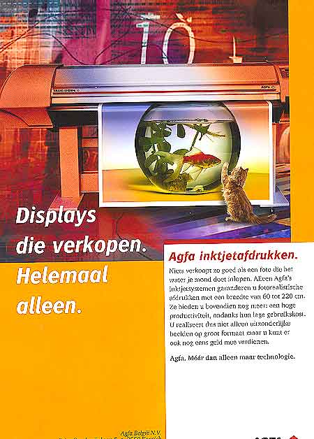
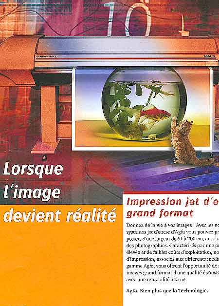
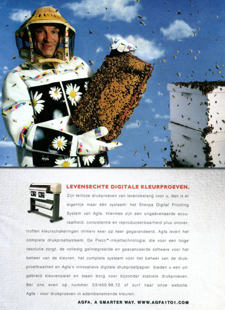
Illustration 5 : True colour
You'll need two players to convince people that your product is synonym with good sharp colourful images. The procedure comes rather expensive because one of the actors needs to gobble the other one down : cat eats fish, cat hunts mouse, mouse savours cheese.

When the receiver is a printing professional, the advised recipe is to enhance the advert with a colour calibration target.

© 
first published: ii.2003; updated: iv.2003, v.2020, iv.2021

Point and shoot
and our camera takes care of everything else. That is what this Spanish advertisement (1) says. The image will materialize before your eyes (it was long before the age of digital cameras !) and then the quality : astounding. The brand is using the very strong couple mouse and cheese. If a mouse can be misled then the image must be extremely realistic, almost to the scent. The same brand in 1986, used Colourful fish in a knowledgeable manner to illustrate brilliant images.

The Color Publishing
System (2) guarantees reliable colour and high image quality in a desktop environment. Notice the absence of a calibration target : at the time desktop publishing wasn't considered serious yet. The lengthy text —lots of cool stuff like WYSIWYG and ‘uvL colour space’— stresses the built-in intelligence : True colour now extremely easy. The cheese in both adverts 1 & 2 is remarkably similar: a big chunk with lots of holes. That is likely to avoid connotations of soap.

(1) 1993 – Shoot and you won't believe your eyes. — digital camera
(2) 1992 – True colour, now child's play. — publishing system
(3) 1996 – Introducing photorealism — inkjet printer

True colour and
image quality is purely visual. And yet, in the Nos. 1 and 2 colour is sold through an olfaction oriented species. The other adverts make use of an eye-hunter.

The output of
this inkjet printer (3) is so extremely realistic —Photorealism™— that someone couldn't resist the temptation. Follow the foot-prints from the fish and find out who cracked.

(4) 1991 – There's only one way out
The Color Laser
Copier (4, image edited to better show the mouse) is a breakthrough in digital colour technology. When we compare with earlier adverts of the same brand in Elephants No. 7 a shift in accent becomes apparent. Back then in 1982 copying and resizing was some­thing and illustrated with hordes of the same species (elephants, ladybugs). In 1991 any decent copier could resize and make good duplicates. Then was the time to stress colour and image quality.

(5) 199? – Colour good enough to eat !
(6) 199? – Dazzling colours

It is remarkable how
how often (gold)fish are chosen to radiate reliable colour (Nos. 3, 5–9). And except for advertisement 7 the fish is always cast as a victim ! Look at the cat in the Nos. 3, 5, 8, and 9 and at the Kingfisher's bill in No. 6.

Cat and bird form also a strong couple, though I couldn't find any sample. Copywriters consider cat and bird in the setting similar to advert 3, where the bird is eaten by the cat, undecent, I suppose. Avoid any chance to disturb the customer. Play it safe with a pest species or a cold-blooded animal.

(7) 1995 – professional colour proofs

Our last goldfishes
are interesting because we have two versions, one in Dutch and a second in French (8 and 9). The French text is the more direct When a picture becomes real. and Make your pictures become alive while the Dutch version only indirectly alludes to the superior quality: Nothing sells better than a picture that brings the water to your mouth. An idea also very appro­priate in view of the fish. Peculiar detail : the printing width is between 60 and 220 cm in Dutch but between 61 and 200 cm in French.

(8) 2003 – Displays that sell auto­nomously. — inkjet printers
(9) 2003 – A picture becomes real. — inkjet printers
(10) 2001 – Lifelike digital proofs — inkjet proofing.

We have one
advertisement which deviates from the common recipe where a predator–prey relationship is used (10). Though the same line of thinking is followed — our colours are so good that prints are taken for the real thing — bees take the place of the predators (cat, mouse, bird). The idea was probably that the colours of the printed flowers are so similar to the colours of real flowers that even a bee cannot tell the difference. Unfortunately, the translation into an image was not entirely successful. The advert (10) transmits not the true colour message! If the print was realistic, the bees should swarm to the flowers and not stay on the combs.

Copywriters make a
clear distinction between colour (printing) professionals and other people. An advertisement directed towards the professional is marked as such by the presence of a white sheet with a colour reference bar. See Nos. 5 – 7, 10, and Goldfish Nos. 13–14