|
A further point is that we have almost no recent
information on the southern part
of the country.
My conclusion is that the maps on this site give
only a picture of our sampling effort and nothing
more. When a map shows a species present in
some square, we know it is there. The reverse is
not true.
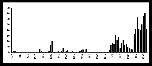
Because we can safely state that we have no real
information on the years before 1975, the maps
are not suited for studies on trends.
Take f.e. Trogulus nepaeformis. The map
suggests
big succes for this formerly rare species.
You know better: we simply put some targetted
pitfalls during 1997.
|
|
Although the situation did improve, we still have no reason
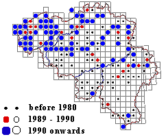
for outburst in congratulations. The map (left) shows when a
square
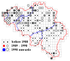
has been sampled for the last time. For many squares
this coincides with the first time! Check it out on the map below.
Only 12 squares have been sampled in all three periods.
A meagre 35 enjoyed two times the visit of an opilionologist.
|

|
|

